• This is default featured slide 1 title

    Go to Blogger edit html and find these sentences.Now replace these sentences with your own descriptions.This theme is Bloggerized by Lasantha Bandara - Premiumbloggertemplates.com.

  • This is default featured slide 2 title

    Go to Blogger edit html and find these sentences.Now replace these sentences with your own descriptions.This theme is Bloggerized by Lasantha Bandara - Premiumbloggertemplates.com.

  • This is default featured slide 3 title

    Go to Blogger edit html and find these sentences.Now replace these sentences with your own descriptions.This theme is Bloggerized by Lasantha Bandara - Premiumbloggertemplates.com.

  • This is default featured slide 4 title

    Go to Blogger edit html and find these sentences.Now replace these sentences with your own descriptions.This theme is Bloggerized by Lasantha Bandara - Premiumbloggertemplates.com.

  • This is default featured slide 5 title

    Go to Blogger edit html and find these sentences.Now replace these sentences with your own descriptions.This theme is Bloggerized by Lasantha Bandara - Premiumbloggertemplates.com.

Showing posts with label Pricing and Value. Show all posts

Monday, April 15, 2019

Uber's Coming out Party: Personal Mobility Pioneer or Car Service on Steroids?

After Lyft’s IPO on March 29, 2019, it was only a matter of time before Uber threw its hat in the public market ring, and on Friday, April 12, 2019, the company filed its prospectus. It is the first time that this company, which has been in the news more frequently in the last few years than almost any publicly traded company, has opened its books for investors, journalists and curiosity seekers. As someone who has valued Uber with the tidbits of information that have hitherto been available about the company, mostly leaked and unofficial, I was interested in seeing how much my perspective would change, when confronted with a fuller accounting of its performance.

Backing up!
To get a sense of where Uber stands now, just ahead of its IPO, I started with the prospectus, which weighing in at 285 pages, not counting appendices, and filled with pages of details, can be daunting. It is a testimonial to how information disclosure requirements have had the perverse consequence of making the disclosures useless, by drowning investors in data and meaningless legalese. I know that there are many who have latched on to the statement that "we may not achieve profitability" that Uber makes in the prospectus (on page 27) as an indication of its worthlessness, but I view it more as evidence that lawyers should never be allowed to write about investing risk.

Uber's Business
Just as Lyft did everything it could, in its prospectus, to relabel itself as a transportation services (not just car services) company, Uber's catchword, repeatedly multiple times in its prospectus, is that it is a personal mobility business, with the tantalizing follow up that its total market could be as large as $2 trillion, if you count the cost of all money spent on transportation (cars, public transit etc.)
Uber Prospectus: Page 11
While the cynic in me pushes me back on this over reach (I am surprised that they did not include the calories burnt by the most common transportation mode on the face of the earth, which is walking from point A to point B, as part of the total market), I understand why both Lyft and Uber have to relabel themselves as more than car service companies. Big market stories generally yield higher valuation and pricing than small market stories!

The Operating History
Uber went through some major restructuring in the three years leading into the IPO, as it exited cash burning investments in China (settling for a 20% stake in Didi), South East Asia (receiving a 23.2% share of Grab) and Russia (with 38% of Yandex Taxi the prize received for that exit). It is thus not surprising that there are large distortions in the financial statements during the last three years, with losses in the billions flowing from these divestitures. In the last few weeks, Uber announced a major acquisition, spending $3.1 billion to acquire Careem, a Middle Eastern ride sharing firm. Taking the company at its word, i.e., that the large divestiture-related losses are truly divestiture-related, let’s start by tracing the growth of Uber in the parts of the world where it had continuing operations in 2016, 2017 and 2018:
Uber Prospectus: Page 21
The numbers in this table are the strongest backing for Uber’s growth story, with gross billings, net revenues, riders and rides all increasing strongly between 2016 and 2018. That good news on growing operations has to be tempered by the recognition that Uber has been unable to make money, as the table below indicates:
Uber Prospectus: Pages 21 & 24
The adjusted EBITDA column contains numbers estimated and reported for the company, with a list of adjustments they made to even bigger losses to arrive at the reported values. I convert this adjusted EBITDA to an operating income (loss) by first netting out depreciation and amortization (for obvious reasons) and then reversing the company’s attempt to add back stock based compensation. The company is clearly a money loser, but if there is anything positive that can be extracted from this table, it is that the losses are decreasing as a percent of sales, over time.

The Rider Numbers
One of Uber’s selling points lies in its non-accounting numbers, as the company reported having 91 million monthly riders (defined as riders who used either Uber or Uber delivery at least once in a month) and completing 5.2 billion rides. To break down those daunting numbers, I focus on the per rider statistics to see the engines driving Uber’s growth over time:
Uber Prospectus: Page 21
There is good and bad news in this table. The good news is that Uber’s annual gross billings per rider rose almost 28% over the three year period, but the sobering companion finding is that the billings/ride are decreasing. Boiled down to basics, it suggests that the growth in overall billings for the company is at least partially driven by existing riders using more of the service, albeit for shorter rides. It could also reflect the fact the new riders for the company are coming from parts of the world (Latin America, for instance), where rides are less expensive.  Finally, I took Uber’s expense breakdown in their income statement, and used it to extract information about what the company is spending money on, and how effectively:
Uber Prospectus: F-4 (income statement in appendix)
I make some assumptions here which will play out in the valuation that you will see below.
  1. User Acquisition costs: Using the assumption that user change over a year can be attributed to selling expenses during the year, I computed the user acquisition cost each year by dividing the selling expenses by the number of riders added during the year.
  2. Operating Expenses for Existing Rides: I have included the cost of revenues (not including depreciation) and operations and support as expenses associated with current riders. 
  3. Corporate Expenses; These are expenses that I assume are general expenses, not directly related to either servicing existing users or acquiring new ones and I include R&D, G&A and depreciation in this grouping.
The good news is that the expenses associated with servicing existing users has been decreasing, as a percent of revenues, indicating that not all of these costs are variable or at least directly linked to more rider usage. Also, corporate expenses are showing evidence of economies of scale, decreasing as a percent of revenues. The bad new is that the cost of acquiring new users has been increasing, at least over this time period, suggesting that the ride sharing market is maturing or that competition is picking up for riders.

More than ride sharing?
Uber is a more complicated company to value than Lyft, for two reasons. The first is that Uber is not a pure ride sharing company, since it derives revenues from its food delivery service (Uber Eats) and an assortment of other smaller bets (like Uber Freight). In the graph below, you can see the evolution of these businesses:
Uber Prospectus: Page 114

It is worth noting this table while suggests that while some of Uber’s more ambitious reaches into logistics have not borne fruit, its foray into food delivery seems to be picking up steam. Uber Eats has expanded from 2.68% of Uber’s net revenues to 13.12%. There is some additional information in another portion of the prospectus, where Uber reports its "adjusted" net revenue and gross Billings by business, and it does look like Uber's net take from Uber Eats is lower than its take from ride sharing:
Uber Prospectus: Pages 102 & 103
While it is clear that Uber's ride sharing customers have been quick to adopt Uber Eats, there are subtle differences in the economics of the two businesses that will play out in future profitability, especially if Uber Eats continues to grow at a disproportionate rate.

Unlike Lyft, which has kept its focus on the US and Canadian markets, Uber's ambitions have been more global, though reality has put a crimp on some of its expansion plans. While Uber's initial plans were to be everywhere in the world, large losses have led Uber to abandon much of Asia, leaving China to Didi and South East Asia to Grab, with India being the one big market where Uber has stayed, fighting Ola for market share and who can lose more money. The fastest growing overseas market for Uber has been Latin America, as you can see in the graph below:

Uber does not provide a breakdown of profitability by geographical region, but the magnitude of the losses that they wrote off when they closed their Chinese and South East Asian operations suggests that the US remains their most lucrative ride sharing market, in terms of profitability. 

The Road Ahead : Crafting a story and value for Uber
1. A Top Down Valuation
In valuing Lyft, I used a top-down approach, starting with US transportation services as my total accessible market and working down through market share, margins and reinvestment to derive a value of $13.9 billion for its operating assets and $16.4 billion with the IPO proceeds counted in. Using a similar approach is trickier for Uber, since its decision to be in multiple parts of the logistics business and its global ambitions require assessment of a global logistics market, a challenge. I did an initial assessment of Uber, using a much larger total market and arrived at a value of $44.4 billion for its operating assets, but adding the portions of Didi, Grab and Yandex Taxi pushed this number up to $55.3 billion. Adding the cash balance on hand as well as the IPO proceeds that will remain in the firm (rumored to be $9 billion), before subtracting out debt yields a value for equity of about $61.7 billion.
The share count is still hazy (as the multiple blank areas in the prospectus indicate) but starting with the 903.6 million shares of common stock that will result from the conversion of redeemable convertible preferred shares at the time of the IPO, and adding in additional shares that will result from option exercises, RSUs (restricted stock units issued to employees) and new shares being issued to raise approximately $10 billion in proceeds, I arrive at a value per share of about $54/share, though  that the updated version of the prospectus, which should come out with the offering price, should allow for more precision on the share count.

2. A Rider-based Valuation
The uncertainty about the total accessible market, though, makes me uneasy with my top down valuation. So, I decided to try another route. In June 2017, I presented a different approach to valuing companies like Uber, that derive their value from users, subcribers or members. In that approach, I began by valuing an existing user (rider), by looking at the revenues and cash flows that Uber would generate over the user’s lifetime and then extended the approach to valuing a new user, where the cost of user acquisition has to be netted out against the user value. I completed the assessment by computing the value drag created by non-rider related costs (like G&A and R&D). In the June 2017 valuation, I had to make do with minimalist detail on expenses but the prospectus provides a much richer break down, allowing me to update my user-based valuation of Uber. The valuation picture is below:
This approach yields a value for the equity of about $58.6 billion for Uber’s equity, which again depending on the share count would translate into a share price of $51/share.

Value Dynamics
The benefits of the rider-based valuation is that it allows us to isolate the variables that will determine whether Uber turns the corner quickly and can make enough money to justify the rumored $100 billion value. The value of existing riders is determined by the growth rate in per-user revenues and the cost of servicing a user, with increases in the former and decreases in the latter driving up user value.  The value of new riders, in the aggregate, is determined by the increase in rider count and the cost of acquiring a new rider. One troubling aspect of the growth in users over the last three years has been the increase in user acquisition costs, perhaps reflecting a more saturated market. In the table below, I estimate the value of Uber's equity, using a range of assumptions for the growth rate in per user revenues and the cost of acquiring a new user:
Download spreadsheet
There are two ways that you can read this table. If you are a trader, deeply suspicious of intrinsic value, you may look at this table as confirmation that intrinsic value models can be used to deliver whatever value you want them to, and your suspicions would be well founded. I am a believer in value and I see this table in a different light.
  • First, I view it as a reminder that my estimate of value is just mine, based on my story and inputs, and that there are others with different stories for the company that may explain why they would pay much more or much less than I would for the company. 
  • Second, this table suggests to me that Uber is a company that is poised on a knife's edge. If it just continues to just add to its rider count, but pushes up its cost of acquiring riders as it goes along, and existing riders do not increase the usage of the service, its value implodes. If it can get riders to significantly increase usage (either in the form of more rides or other add on services), it can find a way to justify a value that exceeds $100 billion. 
  • Third, the table also indicates that if Uber has to pick between spending money on acquiring more riders or getting existing riders to buy more of its services, the latter provides a much bigger bang for the buck than the former. 
Put simply, I hope Dara Khoshrowshahi means it when he says that Uber has to show a pathway to profitability, but I think that is what is more critical is that he acts on those words. In my view, this remains a business, whether you define it to be ride sharing, transportation services or personal mobility, without a business model that can generate sustained profits, precisely because the existing model was designed to deliver exponential growth and little else, and Uber, and the other players in this game), have only a limited window to fix it.


Refreshing the Pricing
Having spent all of this time on Uber's valuation, let me concede to the reality that Uber will be priced by the market, and it will be priced relative to Lyft. That is why Uber has probably been pulling harder than almost any one else in the market for the Lyft IPO to be well received and for its stock to continue to do well in the aftermarket. In the table below, I compare key operating numbers for Uber and Lyft, with Lyft's pricing in the market in place:

In computing the metrics, it is worth remembering that Uber and Lyft use different definitions for basic metrics and I have tried to adjust. For instance, Uber defines riders as those who use the service at least once a month and the closest number that I can get for Lyft is their estimate that they had 18.6 million active quarterly riders. Uber is bigger on every single dimension, including losses, then Lyft. I convert Lyft's current market pricing (on April 12, 2019) into multiples, scaling them to different metrics and applying these metrics to Uber:
Download pricing spreadsheet
In computing Uber's equity value from its enterprise value, I have added the cash ($6.4 billion of cash on hand plus the $9 billion in expected IPO proceeds) $ and Uber's cross holdings ($8.7 billion) to the value and netted out debt ($6.5 billion). To get the value per share, I have used the estimated 1175 million shares that I believe will be outstanding, including options and RSUs, after the offering. Depending on the metric that I can scale it to, you can get values ranging from $47 billion to $124 billion for Uber's equity, though each comes with a catch. If you believe that there are no games that are played with pricing, you should think again! Also, as Lyft's price moves, so will Uber's, and I am sure that there are many at Uber (and its investment banks) who are hoping and praying that Lyft's stock does not have many more days like last Thursday, before the Uber IPO hits the market.

Conclusion
I am sure that there are many who understand the ride sharing business much better than I do, and see obvious limitations and pitfalls in my valuations of both Uber and Lyft.  In fact, I have been wrong before on Uber, as Bill Gurley (who knows more about Uber than I ever will) publicly pointed out,  and I am sure that I will be wrong again.  I hope that even if you disagree with me on my numbers, the spreadsheets that are linked are flexible enough for you to take your stories about these companies to arrive at your value judgments.

Share:

Friday, March 23, 2018

Spotify Loose Ends: Pricing, User Value and Big Data!

In my last post, I valued Spotify, using information from its prospectus, and promised to come back to cover three loose ends: (1) a pricing of the company to contrast with my intrinsic valuation, (2) a valuation of a Spotify subscriber and, by extension, a subscriber-based valuation of the company, and (3) the value of big data, seen through the prism of what Spotify can learn about its subscribers from their use of its service, and convert to profits.

1. The Pricing of Spotify
I won't bore you by going through the full details of the contrast that I see between pricing an asset and valuing it, since it has been at the heart of so many of my prior posts (like this, this and this). In short, the value of an asset is determined by its expected cash flows and the risk in these cash flows, which you can estimate imprecisely using a discounted cash flow model. The price of an asset is based on what others are paying for similar assets, requiring judgments on what comprises similar.  My last post reflected my attempt to attach an intrinsic value to Spotify, but the pricing questions for Spotify are two fold: the companies that investors in the market will compare it to, to make a pricing judgment, and the metric that they will base the pricing on.

Let's start with the simplest version of pricing, a one-on-one comparison. With Spotify, the two companies that are likeliest to be offered as comparable firms are Pandora, a company that is in the same business (music streaming) as Spotify, deriving its revenues from advertising and subscription, and Netflix, a company that is also subscription-driven, and one that Spotify would like to emulate in terms of market success. Since Spotify and Pandora are reporting operating losses, there are only three metrics that you can scale the pricing of these companies to: the number of subscribers, total revenues and gross profits. I report the numbers for all three companies in the table below, in conjunction with the enterprise values for Pandora and Netflix:
For Pandora and Netflix, the numbers for users and revenues/profits come from their most recent annual reports for the year ending December 31, 2017, and for Spotify, the numbers are from the prospectus covering the same year. To use the numbers to price Spotify, I first estimate pricing multiples for Pandora and Netflix. and then use these multiples on Spotify's metrics:
To illustrate the process, I price Spotify, relative to Pandora and based on subscribers, by first computing the enterprise value/subscriber for Pandora (EV/Subscriber= 1135/74.70 = 15.19). I then multiply this value by Pandora's total subscriber count of 159 million to arrive at a pricing of $2,416 million for Spotify. I repeat this process for Netflix, and then repeat it again with both companies, using revenues and gross profit as my scaling variables. The table of pricing estimates that I get for Spotify explains why those who are bullish on the company will try to avoid comparisons to Pandora and encourage comparisons to Netflix. If, as is rumored, Spotify's equity is priced at between $20 and $25 billion, it will look massively over priced, if compared to Pandora, but be a bargain, relative to Netflix. As you can see, each of these comparisons has problems. Spotify not only has a more subscription-based revenue model than Pandora, yielding higher overall revenues, but its more global presence (than Pandora) has insulated it better from competition from Apple Music. Netflix has an entirely subscription-based model and generates more revenues per subscriber, while facing less intense competition.  The bottom line is that the pricing range for Spotify is wide, because it depends on the company you compare it to, and the metric you base the pricing on. That may come as no surprise for you, but it will explain why there will wide divergences in pricing opinion when the stock first starts to trade, resulting in wild price swings. If you are not adept at the pricing game, and I am not, you should stay with your value judgment, flawed though it might be. I will consequently stick with my intrinsic value estimate for the equity in the company.

2. A Subscriber-Based Valuation of Spotify
Last year, I did a user-based valuation of Uber and used it to understand the dynamics that determine user value and then to value Amazon Prime. That framework can be easily adapted to value Spotify subscribers, both existing and new. To value Spotify's existing subscribers, I started with the base revenue per subscriber and content costs in 2017, made assumptions about growth in each item and used a renewal rate of 94.5%, based again upon 2017 numbers (all in US dollar terms):
Download spreadsheet
Note that revenues/subscriber grow at 3% a year, faster than the growth rate of 1.5%/year in content costs, reducing content costs to 70% of subscriber revenues in year 10, consistent with the assumption I made in the top down valuation in the last post. The value of a premium subscriber, allowing for the churn in subscriptions (only 43% make it through 15 years) and reduced content costs, is $108.65, and the total value of the 71 million premium subscriptions works out to about $7.7 billion.

To estimate the value of new users, I first had to estimate how much Spotify was spending to acquire a new user. To obtain this value, I took the total marketing costs in 2017 (567 million Euros or $700 million) and divided that by the number of new subscribers added in 2017:
Cost of acquiring new user = 700 / (71 - 48*.945) = $27.30
While the number of premium subscribers grew from 48 million to 71 million, I reduced the former value by the churn reported (5.5% of subscribers canceled in 2017). The value of new subscribers then can be computed, assuming that the number of net subscribers grows 25% a year from years 1-5, 10% a year from years 6-10 and 1% a year thereafter (The weakest link in this calculation is the churn rate, which as some of you pointed out is measured in monthly terms. I read this section of the prospectus multiple times to get a better sense of renewal and cancellation rates and here is what I get out of that reading. If the true monthly churn rate is 5.5%, the annual churn rate should more than 50%, meaning that 25 million of the 48 million subscribers that Spotify had at the start of the year left during the year. I don't think that happened, because the total subscribers would not have jumped to 71 million. My guess is that the monthly churn rate reflects how new subscribers become established subscribers, with many trying the service for a month, dropping it, and then coming back again. The annualized churn rate is probably closer to 15%-20% overall and much lower for established Spotify subscribers. I considered using a lower renewal rate in the early years and increasing it in later years, but gave up on it since my information is still hazy. I do believe that will be a key factor in whether Spotify can deliver value, and while the trend lines on the churn rate are good, they need to make their subscribers as sticky as Netflix has made its subscribers.)
Download spreadsheet
In valuing the cash flows from new users, I use a 10% US$ cost of capital, the 75th percentile of global companies, reflecting the higher risk in this component of Spotify's value, and derive a value of about $13.6 billion for new users. (I thank the readers who noticed that I was misestimating my subscriber count, starting in year 2. The numbers should now gel, with the growth rate in net subscribers matching up.)

Spotify does get about 10% of its revenues from advertising, and I will assume that this component of revenue will persist, albeit growing at a lower rate than premium subscription revenues; the revenues will grow 10% a year for the next ten year and content costs attributable to these revenues will also show the same downward trend that they do with premium subscriptions. The value of the advertising revenues is shown to be about $2.9 billion:
Download spreadsheet
The final component of value is mopping up for costs not captured in the pieces above. Specifically, Spotify has R&D and G&A costs that amounted to 660 million Euros in 2017 (about $815 million), which we assume will grow 5% a year for the next 10 years, well below the growth rate of revenues and operating income, reflecting economies of scale. Allowing for the tax savings, and discounting at the median cost of capital (8.5%) for a global company, I derive a value for this cost drag:
Download spreadsheet
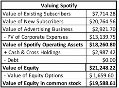
The value for Spotify, on a user-based valuation, can then be calculated, adding in the cash balance (1,5091.81 million Euros or $1,864 million) and a cross holding in Tencent Music that I had overlooked in my DCF (valued at 910 million Euros or $1,123 million), and netting out the equity options outstanding (valued at 1344 million Euros or $1660 million):
Download spreadsheet
The operating asset value is slightly lower than the value that I obtained in my top-down DCF (by about a billion), and there are two reasons for the difference. The first is that I did not incorporate the benefits of the losses that Spotify has to carry forward (approximately $1.7 billion) in my subscriber-based valuation, with the resulting lost tax benefit at a 25% tax rate, of about $300 million. The second reason is that I used a composite cost of capital of 9.24% on all cash flows in top down valuation, whereas I used a lower (8.5%) cost of capital for existing users and a higher (10% cost of capital) for new users; that translates into about $600 million in lower value. The value of equity in common stock, the number that will be most directly comparable to market capitalization on the day of the offering, is $19.6 billion.

3. The Big Data Premium?
There is one final component to Spotify's value that I have drawn on only implicitly in my valuations and that is its access to subscriber data. As Spotify adds to its subscriber lists, it is also collecting information on subscriber tastes in music and perhaps even on other dimensions. In an age where big data is often used as a rationale for adding premiums to values across the board, Spotify meets  the requirements for a big data payoff, listed in this post from a while back. It has exclusivity at least on the information it collects from its subscribers on their musical tastes & preferences and it can adapt its products and services to take advantage of this knowledge, perhaps in helping artists create new content and customizing its offerings. That said, I do no feel the urge to add a premium to my estimated value for three reasons:
  1. It is counted in the valuations already: In both my top down and user-based valuations, I allow Spotify to grow revenues well beyond what the current music market would support and lower content costs as they do so. That combination, I argued, is a direct result of their data advantages, and adding a premium to my estimated valued seems like double counting.
  2. Decreasing Marginal Benefits: The big data argument, even if based on exclusivity and adaptive behavior, starts to lose its power as more and more companies exploit it. As Facebook reviews our social media posts and tailors advertising, Amazon uses Prime to get into our shopping carts and Alexa to track us at home, and uses that data to launch new products and services and Netflix keeps track of the movies/TV that we watch, stop watching and would like to watch, there is not as much of us left to discover and exploit.
  3. Data Backlash: Much as we would like to claim victimhood in this process, we (collectively) have been willing participants in a trade, offering technology companies data about our private lives in return for social networks, free shipping and tailored entertainment. This week, we did see perhaps the beginnings of a reassessment of where this has led us, with the savaging of Facebook in the market. 
The big data debate has just begun, and I am not sure how it will end. I personally believe that we are too far gone down this road to go back, but there may be some buyers' remorse that some of us are feeling about having shared too much. If that translates into much stricter regulations on data gathering and a reluctance on our part to share private data, it would be bad news for Spotify, but it would be worse news for Google, Facebook, Netflix and Amazon. Time will tell!
    YouTube Video


    Data Links
    Share:

    Monday, February 5, 2018

    January 2018 Data Update 10: The Price is Right!

    In my first nine posts on my data update for 2018, I focused on the costs that companies face in raising equity and debt, and their investment, financing and dividend decisions. In assessing those decisions, though, I looked at their actions through the lens of value creation, arguing that investing in projects that earn less than their cost of capital is not a good use of shareholder capital. While this may seem like a reasonable conclusion, it is built on the implicit assumption that financial markets reward value creation and punish value destruction. As any market observer will tell you, markets have minds of their own, sometimes rewarding companies for bad behavior and punishing companies that take the right actions. In this post, I look at market pricing around the world, and point to potential inconsistencies with the fundamentals.

    Value vs Price
    In multiple posts on this blog, I have argued that we need to stop using the words, value and price, interchangeably, that they not only can be very different for the same asset, at any point in time, but that they are driven by different forces, require different mindsets to understand, and give rise to different investment philosophies. The picture below summarizes the key distinctions:

    Understanding the difference between value and price, at least for me, is freeing, because it not only makes me aware of the assumptions that I, as an investor who believes in value and convergence, am making, but also makes me respect and recognize those who might have a different perspective. The bottom line, though, is that the pricing process can sometimes reward firms that take actions that no tonly have no effect on value, but may actually destroy value, and punish firms that are following financial first principles. Even though I believe that value ultimately prevails, it behooves to me to try to understand how the market is pricing stocks, since it will help me be a better investor.

    The Pricing Process
    I will begin with what sounds like a over-the-top assertion. Much of what we see foisted on us as valuation, including those that you see backing up IPOs, acquisitions or big investment decisions, are really pricing models, masquerading as valuations. In many cases, bankers and analysts use the front of estimating cash flows for a discounted cashflow valuation, while slipping in a multiple to estimate the biggest cash flow (the terminal value) in what I call Trojan Horse DCFs. I am not surprised that pricing is the name of the game in banks and equity research, but I am puzzled at why so much time is wasted on the DCF misdirection play. There are four steps to pricing an asset or company well, and done well, there is no reason to be ashamed of a pricing.

    1. Similar, Traded Assets
    To price an asset, you have to find "similar" assets that are traded in the market. Note the quote marks around similar, because with publicly traded stocks, you will be required to make judgment calls on what you view as similar. The conventional practice in pricing seems to be country and sector focused, where an Indian food processing company is compared to other food processing companies in India, on the implicit assumption that these are the most comparable companies. That practice, though, can not only lead to very small samples in some countries, but also can yield companies that have very different fundamentals from the company that you are valuing.
    1.1: With equities, there are no perfect matches: If you are valuing a collectible (Tiffany lamp or baseball card), you might be able to find identical assets that have been bought and sold recently. With stocks, there are no identical stocks, since even with companies that are close matches, differences will persist.
    1.2: Small, more similar, sample or large, more diverse, sample: Given that there are no stocks identical to the one that you are trying to value in the market, you will be faced with two choices. One is to define "similar" narrowly, looking for companies that are listed on the same market as yours, of similar size and serving the same market. The other is to define "similar" more broadly, bringing in companies in other markets and perhaps with different business models. The former will give you more focus and perhaps fewer differences to worry about and the latter a much larger sample, with more tools to control for differences.  

    2. Pricing Metric
    To compare pricing across companies, you have to pick a pricing metric and broadly speaking, you have three choices:
    Post on differences in value
    The market capitalization is the value of equity in a business, the enterprise value is the market value of the operating assets of the firm and the firm value is the market value of the entire firm, including any cash and non-operating assets. While firm value is lightly used, because non-operating assets and cash can skew it, both enterprise value and equity value are both widely used. In computing these metrics, there are three issues that do complicate measurement. One is that market capitalization (market value of equity) is constantly updated, but debt and cash numbers come from the most recent balance sheets, creating a timing mismatch. The second is that the market value of equity is easily observable for publicly traded companies, but debt is often not traded (if bank debt) and book debt is used as a stand in for market debt. Finally, non-operating assets often take the form of holdings in other companies, many of which are private, and the values that you have for them are book values. 
    2.1: When leverage is different across companies, go with enterprise value: When comparing pricing across companies, it is better to focus on enterprise value, when debt ratios vary widely across the companies, because equity value at highly levered companies is much smaller and more volatile and cannot be easily compared to equity value at lightly levered companies.
    2.2: With financial service companies, stick with equity: As I have argued in my other posts, debt to a bank, investment bank or insurance company is more raw material than source of capital and defining debt becomes almost impossible to do at financial service firms. Rather than wrestle with his estimation problem, my suggestion is that you stick with equity multiples.

    3. Scaling Variable
    When pricing assets that come in standardized units, you can compare prices directly, but that is never the case with equities, for a simple reason. The number of shares that a company chooses to have will determine the price per share, and arguing that Facebook is more expensive than Twitter because it trades at a higher price per share makes no sense. It is to combat this that we scale prices to  a common variable, whether it be earnings, cash flows, book value, revenues or a driver of revenues (users, riders, subscribers etc.).


    3.1: Be internally consistent: If your pricing metric is an equity value, your scaling variable has to be an equity value (net income, book value of equity). If your pricing metric is enterprise value, your scaling variable has to be an operating variable (revenues, EBITDA or book value of invested capital). 
    3.2: Life cycle matters: The multiple that you use to judge pricing will change, as a company moves through the life cycle.
    Early in the life cycle, the focus will be on potential market size or revenue drivers, since the company's own revenues are small or non-existent and it is losing money. As it grows and matures, you will see a shift to equity earnings first, since growth companies are mostly equity funded, and then to operating earnings and EBITDA, as mature companies use debt, ending with a focus on book value as a proxy for liquidation value, in decline.

    4. Control for differences
    As we noted, when discussing similar companies, no matter how carefully you pick comparable firms, there will be differences that persist between the company that you are trying to value and the comparable firms. The test of good pricing is whether you detect the variables that cause differences in pricing and how well you control for the differences. In much of equity research, the preferred mode for dealing with these differences is to spin them to justify whatever pre-conceptions you have about a stock.
    4.1: Check the fundamentals: In intrinsic value, we argued that the value of a  company is a function of its cash flows, growth and risk. If you believe that the fundamentals ultimately prevail in markets, you should tie the multiples you use to these fundamentals, and using algebra and a basic discounted cash flow model will lead you to fundamentals drivers of any multiple.

    4.2: Let the market tell you what matters: If you are a pure trader, who has little faith that the fundamentals will prevail, you can can take a different path. You can look at other data, related to the companies that you are pricing, and look for correlation. Put simply, you are trying to use the data to back out what variables best explain differences in market pricing, and using those variables to price your company.
    To illustrate the differences between the two approaches, take a look at my pricing of Severstal, where I used fundamentals to conclude that it was under priced, and my pricing of Twitter, at the time of its IPO, where I backed out the number of users as the key variable driving the market pricing of social media companies and priced Twitter accordingly.

    Pricing around the Globe
    Assuming that you have had the patience to get to this part of the post, let's look at the pricing numbers at the start of 2018, around the world, starting with earnings multiples (PE and EV/EBITDA), moving on to book value multiples (Price to Book, EV to Invested Capital) and ending with revenue multiples (EV/Sales).

    1. Earnings Multiples
    Earnings multiples have the deepest roots in pricing, with the PE ratio still remaining the most used multiple in the world. In the last two to three decades, there has been a decided shift towards enterprise value multiples, with EV/EBITDA leading the way. While I am skeptical of EBITDA as a measure of accessible cash flow, since it is before taxes and capital expenditures, I understand its pull, especially in aging companies with significant depreciation charges. If you assume that depreciation will need to go back into capital expenditures, there is an intermediate measure of pricing, EV to EBIT.

    In the chart below, I look at the distribution of PE ratios globally, and report on the PE ratio distributions, broken down region, at the start of 2018.


    I know that it is dangerous to base investment judgments on simple comparisons of pricing multiples, but at the start of 2018, the most expensive market in the world on a PE ratio basis, is China, followed by India, and the cheapest market is Eastern Europe and Russia. If you would like to see the values for earnings multiples, by country, please click at this link.

    If you are more interested in operating earnings multiples, the chart below has the distribution of EV/EBIT and EV/EBITDA multiples:
    China again tops the scale, with the highest EV/EBITDA multiples, and Eastern Europe and Russia have the lowest EV/EBITDA multiples. Earnings multiples also vary across sectors, with some of the variation attributable to fundamentals (differences in growth, risk and cash flows) and some of it to misplacing. The sectors that trade at the highest and lowest PE ratios are identified below:
    Download industry spreadsheet
    You can download the full list of earnings multiples for all of the sectors, by clicking on this link

    2. Book Value Multiples
    The delusion of fair value accounting is that balance sheets will one day provide better estimates of how much a business in worth than markets, and while I believe that day will never come, even accountants are entitled to their dreams. That said, there are investors who still put their faith in book value and compare market prices to book value, either in equity terms or operating asset terms:

    • Price to Book Equity = Market Value of Equity / Book Value of Equity
    • EV to Invested Capital = (Market Value of Equity + Market value of Debt - Cash)/ (Book value of equity + Book value of Debt - Cash)
    In the table below, I report on price to book and enterprise value to invested capital ratios, by sub-region of the world:


    The most expensive sub-region of the world is  India, on both a price to book and EV/Invested capital basis, and the lowest priced stocks are again in Eastern Europe and Russia. If you would like to see book value multiples, by country, click at this link.  With book value multiples, the differences you observe across sectors not only reflect differences in fundamentals and pricing errors, but also accounting inconsistencies on how capital expenditures in non-manufacturing companies are dealt with, as opposed to manufacturing firms. I tried to correct for these inconsistencies, by capitalizing R&D at all firms, but that correction goes only part way and the most expensive and cheapest sectors, with my corrected book values, are listed below:
    Download industry PBV spreadsheet
    You can download the book value multiple data, by sector, by clicking here.

    3. Revenue Multiples
    To the question of why investors and analysts look at multiples of revenues, my one word answer is "desperation". When every other number in your income statement is negative, you have to keep climbing the statement until you hit a positive value. That said, there is value in focusing on a variable that accountants have the least influence over, and the heat map below captures differences in the enterprise value to sales ratios across the globe.

    Unlike earnings and book value multiples, which have a pronounced peak in the middle of the distribution, revenue multiples are more evenly distributed, with quite a few firms trading at more than ten times revenues. As with earnings and book value multiples, I report revenue multiples, by country at this link and  by sector at this link. Note that there no revenue multiples reported for financial service firms, where neither enterprise value nor revenues can be meaningfully measured or estimated.

    Conclusion
    I am an investor, who believes in value, but it would be foolhardy on my part to ignore the pricing game, since I am dependent upon it ultimately to cash out on my value gains. In this post, I have looked at the pricing differences around the globe, at least based upon market prices at the start of 2018. Of all of my data posts, this is the one that is the most dynamic and likely to change over short periods, since markets can react to change far more quickly than companies can. 

    YouTube Video


    Datasets
    Share:

    Friday, March 10, 2017

    January 2017 Data Update 10: The Pricing Game!

    It's taken me a while to get here, but in this, the last of my ten posts looking at publicly traded companies globally, I look at pricing differences across regions and sectors. I laid out my rationale for looking at pricing in my most recent post on the topic, where I drew a distinction between good companies, good management and good investments, arguing that investing is about finding mismatches between reality (as driven by cash flows, growth and risk) and perception (as determined by the market). 

    Multiple = Standardized Price
    When looking at how stocks are priced and especially when comparing pricing across stocks, we almost invariably look at pricing multiples (PE, EV to EBITDA) rather than absolute prices. That is because prices per share are a function of the number of shares and are, in a sense, almost arbitrary. Before you respond with indignation, what I mean to say is that I can make the price per share decrease from $100/share to $10/share, by instituting a ten for one stock split, without changing anything about the company. As a consequence, a stock cannot be classified as cheap or expensive based on price per share and you can find Berkshire Hathaway to be under valued at $263,500 per share, while viewing a stock trading at 5 cents per share as hopelessly overvalued. 

    The process of standardizing prices is straight forward. In the numerator, you need a market measure of value of  equity, the entire firm (debt + equity) or the operating assets of the firm (debt + equity -cash = enterprise value). If you confused about the distinction, you may want to review this post of mine from the archives. In the denominator, you can scale the market value to revenues, earnings, accounting estimates of value (book value) or cash flows.

    As you can see, there is a very large number of standardized versions of value that you can calculate for firms, especially if you bring in variants on each individual variable in the denominator. With net income, for instance, you can look at income in the last fiscal year (current), the last twelve months (trailing) or the next year (forward). The one simple proposition that you should always follow is to be consistent in your definition of multiple.

    The "Consistent Multiple" Rule:   If your numerator is the market value of equity (market capitalization or price per share), your denominator has to be an equity measure as well (net income or earnings per share, book value of equity. For example, a price earnings ratio is consistent, since both the numerator and denominator are equity values, and so is an EV to EBITDA multiple. A Price to EBITDA or a Price to Sales ratio is inconsistent, since the numerator is an equity value and the denominator is to the entire business, and will lead to conclusions that are not merited by the fundamentals.

    Pricing – A Global Picture
    To see how stocks are priced around the world at the start of 2017, I focus on four multiples, the price earnings ratio, the price to book (equity) ratio, the EV/Sales multiple and EV/EBITDA. With each multiple, I will start with a histogram describing how stocks are priced globally (with sub-sector specifics) and then provide country specific numbers in heat maps. 

    PE ratio 
    The PE ratio has many variants, some related to what period the earnings per share is measured (current, trailing or forward), some relating to whether the earnings per share are primary or diluted and some a function of whether and how you adjust for extraordinary items. If you superimpose on top of these differences the fact that earnings per share reported by companies reflect very different accounting standards around the world, you can already start to see the caveats roll out. That said, it is still useful to start with a histogram of PE ratios of all publicly traded companies around the world: 
    Note that of the 42,668 firms in my global sample, there were only 25,493 firms that made it through into this graph; the rest of the sample (about 40%) had negative earnings per share and the PE ratios was not meaningful.  While the histogram provides the distributions by regional sub-groups, the heat map below provides the median PE ratio by country: 
    If you go to the live heat map, you will also be able to see the 25th and 75th quartiles within each country, or you can download the spreadsheet that contains the data.  I mistrust PE ratios for many reasons. First, the more accountants can work on a number, the less trustworthy it becomes, and there is no more massaged, manipulated and mangled variable than earnings per share. Second, the sampling bias introduced by eliminating a large subset of your sample, by eliminating money losing companies, is immense. Third, it is the most volatile of all of the multiples as it is based upon earnings per share.

    Price to Book 
    In many ways, the price to book ratio confronts investors on a fundamental question of whether they trust markets or accountants more, by scaling the market’s estimate of what a company is worth (the market capitalization) to what the accountants consider the company’s value (book value of equity). The rules of thumb that have been build around book value go back in history to the origins of  value investing and all make implicit assumptions about what book value measures in the first place. Again, I will start with the histogram for all global stocks, with the table at the regional level imposed on it: 
    The price to book ratio has better sampling properties than price earnings ratios for the simple reason that there are far fewer firms with negative book equities (only about 10% of all firms globally) than with negative earnings. If you believe, as some do, that stocks that trade at less than book value are cheap, there is good news: you have lots and lots of buying opportunities (including the entire Japanese market). Following up, let’s take a look in the heat map below of median price to book ratios, by country. 
    Again, you can see the 25th and 75th quartiles in either the live map or by downloading the spreadsheet with the data. Pausing to look at the numbers, note the countries shaded in green, which are the cheapest in the world, at least on a price to book basis, are concentrated in Africa and Eastern Europe, arguably among the riskiest parts of the world. The most expensive countries are China, a couple of outliers in Africa (Ivory Coast and Senegal, with very small sample sizes) and Argentina, a bit of a surprise.

    EV to EBITDA 
    The EV to EBITDA multiple has quickly grown in favor among analysts, for some good reasons and some bad. Among the good reasons, it is less affected by different financial leverage policies than PE ratios (but it is not immune) and depreciation methods than other earnings multiples. Among the bad ones is that it is a cash flow measure based on a dangerously loose definition of cash flow that works only if you live in a world where there are no taxes, debt payments and capital expenditures laying claim on those cash flows. The global histogram of EV to EBITDA multiples share the positive skew of the other multiples, with the peak to the left and the tail to the right: 
    Again, there will be firms that had negative EBITDA that did not make the cut, but they are fewer in number than those with negative EPS.  Looking at the median EV to EBITDA multiple by country in the heat map below, you can see the cheap spots and the expensive ones. 
    As with the other data, you can get the lower and higher quartile data in the spreadsheet. As with price to book, the cheapest countries in the world lie in some of the riskiest parts of the world, in Africa and Eastern Europe. China remains among the most expensive countries in the world but Argentina which also made the list, on a  price to book basis, drops back to the pack.

    EV to Sales 
    If you share my fear of accounting game playing, you probably also feel more comfortable working with revenues, the number on which accountants have the fewest degrees of freedom. Let’s start with the histogram for global stocks: 
    Of all the multiples, this should be the one where you lose the least companies (though many financial service companies don’t report conventional revenues) and the one that you can use even on young companies that are working their way through the early stages of the life cycle.  The median EV/Sales ratio for each country are in the heat map below: 
    You can download more extensive numbers in the spreadsheet. By now, the familiar pattern reasserts itself, with East European and African companies looking cheap and China looking expensive. With revenue multiples, Canada and Australia also enter the overvalued list, perhaps because of the preponderance of natural resource companies in these countries.

    Pricing – Sector Differences 
    All of the multiples that I talked about in the last section can also be computed at the industry level and it is worth doing so, partly to gain perspective on what comprises cheap and expensive in each grouping and partly to look for under and over priced groupings. The following table, lists the ten lowest-priced and highest priced industry groups at the start of 2017, based upon trailing PE: 
    Multiples by Sector
    In many of the cheapest sectors, the reasons for the low  pricing are fundamental: low growth, high risk and an inability to generate high returns on equity or margins. Similarly, the highest PE sectors also tend to be in higher growth, high return on equity businesses. I will leave the judgment to you whether any fit the definition of a cheap company. The entire list of multiples, by sector, can be obtained by clicking on this spreadsheet.

    One comparison that you may consider making is to pick and multiple and trace how it has changed over time for an industry group. Isolating pharmaceutical and biotechnology companies in the United States, for instance, here is what I find when it comes to EV to EBITR&D for the two groups over time:

    You can read this graph in one of two ways. If you are a firm believer in mean reversion, you would load up on biotech stocks and hope that they revert back to their pre-2006 premiums, but I think you would be on dangerous ground. The declining premium is just as much a function of a changing health care business (with less pricing power for drug companies), increasing scale at biotech companies and more competition. 

    Rules for the Road
    1. Absolute rules of thumb are dangerous (and lazy): The investing world is full of rules of thumb for finding bargains. Companies that trade at less than book value are cheap, as are companies that trade at less than six times EBITDA or have PEG ratios less than one. Many of these rules have their roots in a different age, when data was difficult to access and there were no ready tools for analyzing them, other than abacuses and ledger sheets. In Ben Graham's day, the very fact that you had collected the data to run his "cheap stock" screens was your competitive advantage. In today's market, where you can download the entire market with the click of a button and tailor your Excel spreadsheet to compute and screen, it strikes me as odd that screens still remain based on absolute values. If you want to find cheap companies based upon EV to EBITDA, why not just compute the number for every company (as I have in my histogram) and then use the first quartile  (25th percentile) as your cut off for cheap. By my calculations, a company with an EV/EBITDA of 7.70 would be cheap in the United States but you would need an EV to EBITDA less than 4.67 to be cheap in Japan, at least in January 2017.
    2. Most stocks that look cheap deserve to be cheap: If your investment strategy is buying stocks that trade at low multiples of earnings and book value and waiting for them to recover, you are playing a game of mean reversion. It may work for you, but there is little that you are bringing to the investing table, and there is little that I would expect you to take away. If you want to price a stock, you have to bring in not just how cheap it is but also look at measures of value that may explain why the stock is cheap. 
    3. If you are paying a price, you are "estimating" the future: When I do an intrinsic valuation (as I did a couple of weeks ago with Snap), I am often taken to task by some readers for playing God, i.e., forecasting revenue growth, margins and risk for a company with a very uncertain future. I accept that critique but I don't see an alternative. If your view is that using a multiple lets you evade this responsibility, it is because you have chosen not to look under the hood, If you pay 50 times revenues for a company, which is what you might be with Snap, you are making assumptions about revenue growth and margins, whether you like it or not. The only difference between us seems to be that I am being explicit about my assumptions, whereas your assumptions are implicit. In fact, they may be so implicit that you don't even know what they are, a decidedly dangerous place to be in investing.


    Share:

    Labels

    Blog Archive

    Recent Posts

    Unordered List

    Theme Support